Before and After: Upstairs Family Room
My husband’s out of town, so it’s just me and Kate this weekend. I never sleep well when he’s gone (anyone else?! 🙋🏻), and I woke up before 5am. In my haze, I decided to mix up my morning coffee scenery and made my way upstairs to our family room for some quiet time before Kate woke up. While there, I posted a few Instagram stories of the space and received some questions. Then I remembered I hadn’t shared this room on the blog yet. Today (well, tonight as I’m writing 🙃), I’m correcting that!
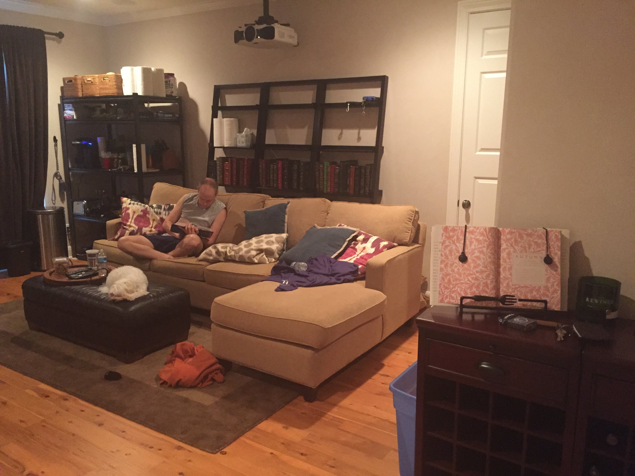
Before.
After.
I’ll keep this post brief (I’m tired!), but I did want to showcase some before and after photos because it’s a pretty dramatic change. It’s amazing what new flooring and paint can do. The space is so much lighter and brighter now. Aside from adding a built in media and toy storage cabinet, nothing structurally changed. We also updated the ceiling fan. Otherwise it’s all a decor story!
I do come up here occasionally to watch Bravo, but to be honest we don’t spend a ton of time lounging in this room yet. Mainly because of the dogs. They’re old and can’t get up the stairs on their own. We just feel bad leaving them downstairs without us. I do foresee that changing sometime soon though. At this stage, we’ve been able to keep Kate’s toys pretty contained downstairs, but she’ll be crawling and much more active in the next few months. When that time comes, she’ll need more space to play and we’ll transition all of her toys to this area.
Before.
The original owners of this home used this room as a yoga studio. In fact, when we moved in, several of our neighbors mentioned to us that they took private yoga sessions here - ha! I mention this because that’s why you see holes in the wall in the picture above. Floor to ceiling mirrors hung there, which we - of course - removed. I can’t find a picture of it on my phone, but behind the mirrors we found messages and bible verses from the previous owners they had written when the house was being built in 1997. So sweet and special. 💙
After.
Above you can see what that formerly mirrored wall looks like now. Built-ins! I decided to pay a little extra to carry the cabinetry all the way to the ceiling to avoid a dust trap, which was (to me) worth every penny. Plus, I think it gives the room the appearance of having higher ceilings. We went with closed vs. open shelving in order to 1) save money on accessories and 2) create storage for toys since this room also serves as our playroom. The cabinets are fairly empty at the moment, but give us a year and I’m sure they’ll be bursting at the seams! 🧸
2016.
And finally, I had to include the picture above for my memory’s sake. This room served as our makeshift apartment for about 6 months while our downstairs was being renovated. We even had a little kitchenette area (which you can see on the shelves in the far corner of the room). A pretty tight squeeze for the two of us + two pups (and my little brother lived with us at the time). Needless to say we were very grateful to move out of this room once the downstairs was finished!
And even more grateful for how beautiful the space is now, 3 years later!
PRODUCT LINKS & SOURCE INFO
Design: Heather Scott Home & Design
Paint: Wall Color - Benjamin Moore “Paper White” / Ceiling - Benjamin Moore - “Ice Cap” / Media Cabinet - Sherwin Williams “Rain” / Trim: Benjamin Moore “Chantilly Lace”
Cabinetry: Jed Paul Custom Cabinetry & Woodwork
Ceiling Fan: Haiku L Smart Ceiling Fan (Black)
Art: Custom piece by Taelor Fisher (For more information about the artwork, read this blog post. )
Curtains: Custom in the “Radish” textile print by Radish Moon
Upholstered Furniture: Unfortunately, all of the furniture you see here is custom ordered, so I can’t share exact links (sorry!). However, Pottery Barn sells a very similar sectional to ours called the Pearce (the Townsend is also very similar). I had a PB sectional in a microfiber material in our last home and found the quality to be great. In fact, it’s actually at my mom’s place now! I wanted to also mention that our sectional contains a pull out sofa, which is such a nice upgrade option if you think you’ll get use out of it.
Side Table Lamps: Barclay Butera for Bradburn Home (less expensive, similar version here)
Picture Frames: Two’s Company & Tozai Home
Drink Coasters: One Kings Lane
All Other Accessories: Heather Scott Home & Design
Note: If I haven’t listed the information for something you’re interested in, just leave a comment and I will try my best to track it down for you!
Photography: Shelly Borga + my iPhone 💁🏻


