Before and After: Formal Dining & Butler’s Pantry
Just a quick and easy home renovation related post today. I’m sharing some before and after images of our formal dining room and butler’s pantry. 🎉 And, this is wholly unrelated, but I feel like you should know that I’m writing this post from my hotel bar in Dallas sipping a spritz and nomming on some nachos BY MYSELF. Truly living my best life in this moment. Also, this bar is always a SCENE (👀), so the people watching is beyond epic. Cheers to that! 🍾🥂
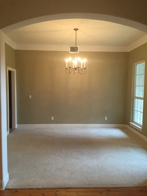
First, let me just say that I wish I had some better before pictures of the dining room, but unfortunately I don’t. Sorry!
Moving on though. Originally, I wanted grasscloth wallpaper in this space. Then I got the bid back, and that idea was quickly canned to cut costs. Who knew wallpaper was so expensive?! 😲 Instead, we decided to paint our study (which sits directly across this room) a deep, moody shade of blue to make a statement. This was a smart, affordable trade and added the color punch I wanted off the entryway of our home. Also, I’m realizing I haven’t shared our downstairs study yet, so I’ll do that space next.
Before: Formal Dining Room
After: Formal Dining Room (and a peak into the Butler’s Pantry)
As you can see in the after photo above, the only changes here are paint, lighting, and a new niche in the back wall. This room is actually quite small considering the square footage of our home. Our dining table does fit eight, but it’s a super tight squeeze. Because the niche wall backs up to our garage, we were able to bust through and add a 12-inch deep space to fit a narrow buffet table. Not only does this create more storage space for me, but to be honest without this buffet (which we topped with lamps, ginger jars, and a starburst mirror), the room would be pretty boring. It created an opportunity to add a design layer and a functional element (I store entertaining items in here… small things like candles, votives, and vases). 👌🏻
Close up of the newly added niche.
After: Formal Dining Room
Moving on the Butler’s Pantry. What’s a butler’s pantry? For us, it’s a hallway connecting our kitchen and dining room that’s stocked to the brim with booze. Someone on Instagram DM’d me dubbing it an “alco-hallway”, which I fully support and this is now it’s formal name. Butler’s pantry is much too serious and stuffy and let’s not kid ourselves… there’s no butler around here. Alcohallway, however? Absolutely yes.
Below are two before pictures of the space. It was nice, but very late 90’s, early 2000’s vibes.
Before: Butler’s Pantry
Before: Butler’s Pantry
Since our kitchen is so white and the formal dining is also super neutral, we decided to paint the cabinetry a dark, blueish gray for some contrast. We also added a beverage fridge and a wine fridge for additional drink storage. The counters are the same quartz as our kitchen, and the backsplash tiles are a matte white, almost Moroccan-inspired tile. Simple, clean and classic, but with a touch of modern.
After: Butler’s Pantry
I love how it turned out. And by the way, that silver tray you see above is an antique from England circa the late 1800’s. Owning it makes me feel SO fancy. 👸🏻 I’d been searching for a tray like this for a while and finally found one I loved. I highly recommend slowly adding antique pieces like this to your home. I have a few, but not many. If we ever move and I’m blessed with an opportunity to decorate something again, I’ll have more patience during the design process and incorporate more antique pieces.
Finally, I mentioned this on my Instagram stories a couple weeks ago, but we decided to add wallpaper to the alcohallway. That’s my next project. It just needed a little something more to add some fun and interest. Wallpaper is such an easy way to accomplish that! And I have to say… even my husband has come around on wallpaper. During the design process he resisted it HARD. It was a budget “win” I let him have because tbh we needed to trim some costs anyway. But, I did convince him (after the fact) to add grasscloth wallpaper to our powder bathroom, and now he’s changed his mind on wallpaper. He saw the transformation, agrees it’s worth the money when done right, and has obliged me in my desire to add some to this space. So stay tuned to see what we choose!
Design: Heather Scott Home & Design
Wall Color: Benjamin Moore’s Classic Grey
Cabinet Color: Sherwin William’s Storm Cloud
If you have any sourcing questions, just ask in the comments below and I’ll do my best to track down the information for you! 😘


