Family Room: Before and After
Doing another before and after reveal today! This time I’m sharing with y’all the most used space in our entire home…. our family room. David and I hang out in here with the dogs and Kate all the time. While we keep most of her toys upstairs, we’ve got some of them down here in a basket sitting in a corner. Here’s a link to the toy basket if you’re interested. It’s the same style as the one our faux fiddle fig tree sits in.
As a refresher, here’s links to our kitchen, pantry, breakfast room, nursery, and powder bath in case you missed those reveals.
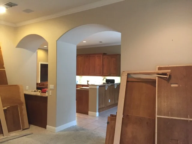
As you can see from the before picture above, this room was quote the transformation. The biggest change we made was to knock out these bookshelves. The one on the right was an entertainment bookcase that was intended to house a television. David and I didn’t want to have the TV tucked away in a corner because we watch a LOT of TV. We didn’t mind having it bc front and center, so we hung it over the mantle. I also wanted the bookshelves to match on both sides, so down they went.
Another thing I’ll point out that you probably wouldn’t notice otherwise is that we added a limestone cap on the fireplace hearth. It added about 3 inches in height and just made the fireplace look more finished. We also replaced the mantle. I searched high and low for a mantle online but couldn’t find one substantial enough in size. I didn’t want it to look dinky since I know our TV is huge. I finally found this sweet old man who lives north of Austin to make one custom for me. I got the exact size needed for the space, plus we stained it to match the beams and hardwood floors so everything tied together.
Structurally, we did make a few changes. First, we elongated a wall in the kitchen to close off this space a bit. Not only did it help create a cozy vibe (important for a family room, I think), but it also gave us the added benefit of more wall space for kitchen cabinets. Before we added this wall, there was an arched pass through to the kitchen (which you can kind of see on the far right in the picture above). I guess the original owners intention was to use this counter space for snacks? I don’t know. It just didn’t make sense anymore.
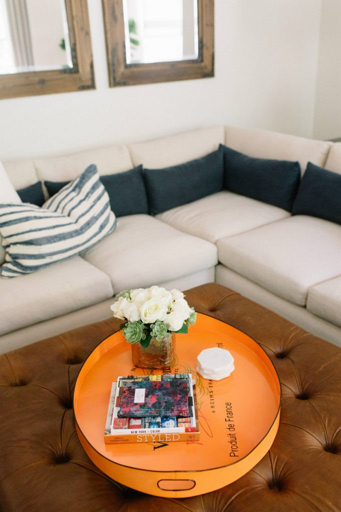
I wish I had direct links for the sectional and that leather ottoman, but they’re both custom. If I find good dupes, I’ll update this post later. The couch is super deep (that was a requirement of ours!) and the ottoman is so large and substantial and I love the cognac color. We chose to go the leather route so it would be more comfortable to prop our feet on.
The picture above gives a better look at that aforementioned pass through to the old kitchen. Also notice on the right side of that picture is an archway and a wall. We knocked both of those out to be all open. On the opposite side of that wall was a bill pay desk, which we had no use for. So now the room completely opens up to the breakfast room.
Included this picture to showcase my orange, Veuve Clicquot drink tray which is one of my prized possessions I kid you not. I had been searching around the internet for a WHILE trying to find one, then one day I happened to walk in Heather’s store and there one was sitting! I scooped it right up. God knows how much I paid for it, but it wasn’t cheap and I 0% care because I’ll have it forever. Love it so much.
You can see this room had carpet before. We ripped out all the carpet in the home and replaced everything with wood floors. David and I are not carpet fans.
One of my most asked questions on Instagram is about these ombre curtains. Originally, Heather’s design called for these beautiful navy curtains that had a sort of ivory ikat design. They were great and would have looked fabulous. But I wanted something a little more youthful. It was around this time that blogger Emily Jackson (Ivory Lane) did her kitchen reveal, and I was inspired by her purple ombre roman shades. I told Heather, she found the fabric, and here we are. So sorry - they’re custom and I haven’t been able to find a decent dupe.
In the photo below you can see a good view of the tic tac toe design ceiling beams we added. They add so much dimension to the space and tie in nicely with our hardwoods and the beams in our kitchen.
The chairs you see on the left above swivel to face the television. One of the guidelines we gave Heather for this space was a LOT of seating. As much as possible. Our house serves as the hub for family get togethers fairly often, and there have definitely been occasions where every single seat available in this room was occupied.
Added a close up shot of the bookshelf for good measure. When it comes to decorating bookshelves, less is more! I would say that’s the most common mistake I see in people’s homes. They fill their bookshelves with items that are too small and pack too much stuff on each shelf so the scale is all off. Better to spend a little more on more substantial pieces than a dozen tiny knick knacks. These shelves do look a tad different now because I wanted to add more picture frames, but essentially they’re still styled almost the same way.
I do have one regret for this space. Originally, we were going to add library-style lights over the bookshelves flanking either side of the fireplace. But then, we had to cut the budget. Those were the easiest thing to cut, so that’s what we did. I still think about them! Finally, we decided to do closed storage space on the bottom third of these cabinets so we could keep board games and blankets tucked away and out of sight.
And that completes this room reveal! Hope you enjoyed our blue and white family room as much as we do!
PRODUCT LINKS
Design: Heather Scott Home & Design
Cabinet Paint Color: Benjamin Moore “White Dove”
Wall Color: Benjamin Moore “Classic Grey”
Trim & Ceiling Color: Benjamin Moore “Chantilly Lace”
Ceiling Fan: Fanimation
Ombre Curtains: Custom via Heather Scott Home & Design
Sectional: Custom via Heather Scott Home & Design
Leather Ottoman: Custom via Heather Scott Home & Design
Swivel Side Chairs: Custom via Heather Scott Home & Design, but here’s a VERY similar chair from Serena & Lily
Nesting Side Tables: Rouse Home (Gold)
Toy Basket: Pottery Barn
Fiddle Fig Leaf Tree (Faux): Heather Scott Home & Design, but here’s a similar (very substantial) one from Neiman Marcus
Fiddle Fig Tree Basket: Pottery Barn
Side Table Lamp: AERIN for Visual Comfort (Black)
Console Table Lamps: mitchell gold + bob williams
Decorative Moss Balls: One Kings Lane
Decorative Books: Mine are from ALL over! Checkout Amazon for used books and Half Price Books
Note: I know I didn’t source every single thing in this room. Ran out of time! Progress not perfection, ya know? If you want to know where a certain item is from, just leave a message in the comments and I’ll track it down and send it to you.


