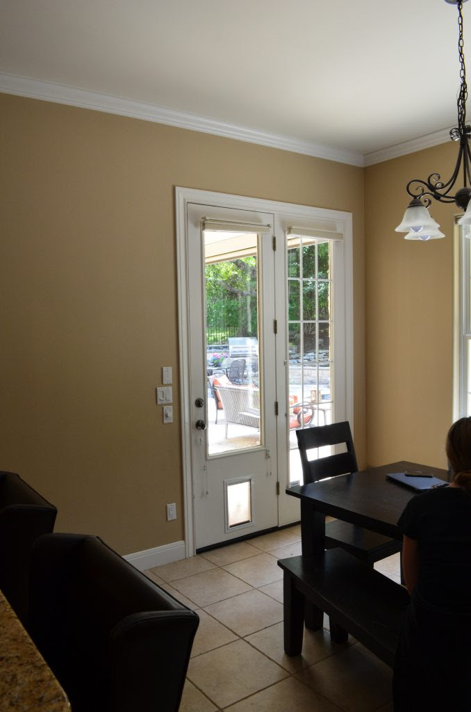
Breakfast Room Before and After
Here’s another before and after post for y’all! I shared our kitchen a few weeks back, and this time I’m sharing our Breakfast Room. This space is located right off our kitchen and family room and is where we eat the majority of our meals. It’s also been a great place to congregate and play games (we’re big Crazy/Mexican Train fans!) or drink wine with family and friends. It gets used daily!
As you can see in the picture below, there was originally a bill pay desk in between the breakfast room and the family room. We obviously knocked that out + removed the pillars and squared off the arches for a more modern look. It really opened up the space and improved the natural light our home gets.
As you can see, we updated the light fixture as well. The new pendant coordinates with the two chandeliers we have hanging over our new double islands in the kitchen.
We ran the same wood floors through this space as the rest of our downstairs for a seamless flow between rooms (I’m not a huge fan of flooring transitions). My husband was worried about putting wood in the kitchen and breakfast area, but it hasn’t been a problem at all. No warping or water damage so far! We’re just careful to clean up after our Scottish Terrier, Charles. He has a beard and tends to drip water everywhere when he drinks out of his water bowl (which typically sits next to the back door you see here).
We also added a built in bench feature underneath the windows so we’d have a little more space to walk through that exterior door into the backyard. That door gets used a lot, so we wanted plenty of room to navigate that pathway without having to move a chair out of the way all the time.
The only other architectural feature change we made was to add stained box beams to the ceiling. Adding those made a big difference and the stain coordinates with our wood floors perfectly. The wall color is Benjamin Moore “Classic Grey” and the trim and ceiling are Benjamin Moore “Chantilly Lace”.
The table is a polished marble top and the french bistro chairs are from Serena & Lily (but you can seriously find them anywhere these days!). They’re SUPER lightweight and extremely comfortable. We’ve sat as many as 10 people around this tulip-style table thanks to its oval shape. The bench fabric is Sunbrella so it’s extremely stain resistant and holds up well with the light streaming in those windows all day. The pillows and roman shades were custom made via Heather Scott Home & Design, who designed the space.
PRODUCT LINKS
Marble Tulip-Style Dining Table: Similar Here (unsure exact brand)
French Bistro Chairs: Serena and Lily or Williams Sonoma
Fiddle Fig Leaf Tree (Faux): Heather Scott Home & Design
Fiddle Fig Leaf Tree Basket: Pottery Barn
Light Fixture: Visual Comfort Darlana Lantern Pendant in black
Roman Shades: Custom, Heather Scott Home & Design
Pillows & Bench Cushion: Custom, Heather Scott Home & Design
Wall Color: Benjamin Moore “Classic Grey”
Trim & Ceiling Color: Benjamin Moore “Chantilly Lace”
Flower Vase: Crate and Barrel
Muffin Basket: Crate & Barrel
Water Pitcher: Crate & Barrel
Stemless Wine Glasses: Crate & Barrel


